
In the first of two articles on data-driven school improvement, Patrick Sanders (Associate Head of the Crowther Centre, Curriculum and Assessment at Brighton Grammar School) shares the steps that have been taken to capture better quality, and more actionable, data to inform decision-making.
At Brighton Grammar School, an independent school in Melbourne, we’ve been on a journey of school improvement for the best part of a decade. As part of that journey, we’ve put a strong emphasis on making the best decisions possible on important questions such as:
- What programs are working well?
- Are students making good progress?
- Which students need more support? Is the support in place effective?
- Are there students or subjects that need more of a focus?
These are questions that teachers and leaders ask themselves all the time. As we looked to answer these questions ourselves, we found that the data available to answer them was lacking in quality, hadn’t been captured or took large amounts of time to interpret. In response, a plan was constructed to develop systems that would allow us to capture better quality, and more actionable data, including these steps:
- Provide teacher ownership – getting data into the hands of teachers and having them capture their own impact
- Construct a data warehouse – centralising the available data from across the whole school to help track and make connections between data sources
- Establish data cycles – calendarising cyclic data, including processing and using
- Develop and refine data metrics – improving the quality and range of data captured
Teacher ownership to capture impact
It may seem like ‘develop and refine data metric’ should perhaps come before using the data, but given we had a strong base in data collection and use already, we felt it was best to just start using available data; this shined a light on the deficiencies of some metrics and got people sharing practice about what’s working. If you don’t have the teachers owning and regularly using data, the whole project is likely to fall apart.
The catalyst for this action was brought about through the school’s original implementation of Visible Learning (Hattie, 2008) as a framework. A strong emphasis was placed on ‘Know thy impact’; this part of Visible Learning focuses on encouraging teachers to measure the progress of their students. While we ultimately moved away from using this framework, these ideas are still heavily embedded in current practice and provided a spark for many teachers to start using data.
Given the time-poor nature of teachers, we wanted and still want them focusing primarily on lesson preparation and helping their students. With that in mind we’ve looked to streamline some of the data analysis by creating time-efficient data visuals for quicker analysis. An example is provided later as Figure 2.
Making connections through a ‘data warehouse’
Even with our teachers collecting and using quality data, at this point it was limited primarily to class level data (such as attendance) or isolated standardised tests (such as NAPLAN). This meant that only limited analysis was possible. The solution to this problem was to create an online data warehouse – a place where data is systematically organised for analysis and production of reports. Having the data in a central location provides many advantages:
- Tracking cohorts or students over time – allowing us to allocate resources appropriately, such as literacy or numeracy support.
- Linking data from different sources – providing the ability to triangulate using different data sources and different years. Analysis can then be completed with a lot more certainty as most data has very limited reliability. An example is using multiple years of NAPLAN data to look at trends over longer time scales.
- Quick and easy access to data – having the data centralised provides many opportunities for easier access. An example is having Power BI visuals that draw from this data warehouse that are linked into a team on Microsoft Teams. The team can access the appropriate data in seconds.
The data warehouse allowed reports and dashboards to be created that weren’t otherwise possible, ultimately providing new insights.
For many schools a data warehouse would simply be a collection of files stored in one spot on a shared drive. However, we wanted to be able to automate many of the relationships and storage, so we used a Structured Query Language (SQL) database – they are particularly good at relational data of this nature.
Having a data warehouse of this nature isn’t necessary to get started with data, but it should be thought of as a supercharger that can help to build momentum for any data projects.
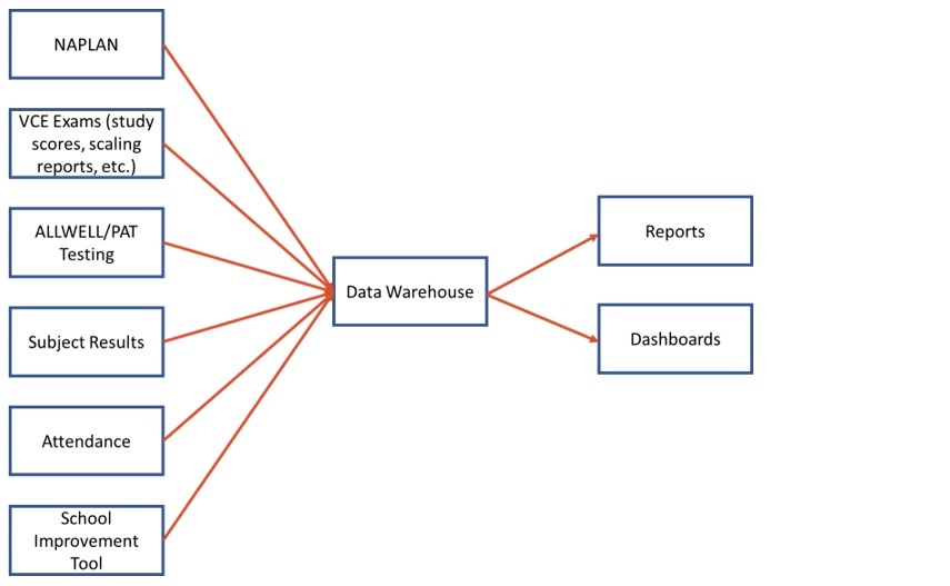
[Figure 1: Data warehouse inputs and outputs]
Documenting data cycles to plan for use
Every year we were getting lots of data coming that was being centralised and stored well within the data warehouse; we were, however, lacking a systematic plan to make sure we were using it in an effective manner.
Each year we would ask ourselves ‘Okay, we’ve got this data that’s just come in, what are we going to do?’ which wasn’t particularly effective. While a simple idea, constructing a plan for data that became available at set times has allowed continual improvement for data use at the school.
In the initial stages, a small group was put together to construct the original plan for how and when data would be captured and used, but only small refinements and additions have been required since.
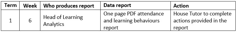
[Table 1: An excerpt from a data cycles document]
Improving validity and capturing additional data
With the data organised being used regularly, and having a plan for its use, it was still apparent that we were either missing metrics on some aspects of the school or the metrics had poor validity. For example, we weren’t capturing data on student voice or parent trust of the school.
To resolve the issue of uncaptured data, we developed our School Improvement Tool; a wide-ranging annual survey that captures the thoughts and attitudes of the school community (staff, students and parents) on a range of areas. This has provided us with invaluable insights into the perceptions of different stakeholders on issues such as trust, program development, subject offerings and leadership, and allowed us to take actions to improve many aspects of the school.
For example, over a couple of years parents had indicated a lower level of leadership presence in a particular area of the school; we were able to respond to this by modifying the location of some staff and a few of their responsibilities to address this. The historical results we have now also act as a basis for comparisons in future years and provides a means to track the effectiveness of changes we make at the school.
To improve the validity of some metrics, we modified several measures to be analysed in comparison to other measures. For instance, teachers were provided a graph as shown as Figure 2. This showed them the relative performance of students in their class compared to the median score for each student in all their classes.
Using the student’s median result in their subjects as a comparison allows a quick analysis of who may be underperforming in the subject. Teachers can then have a conversation with the students to try and determine why this is the case; in many cases this would lead to some customised additional supports for the student to help them with their learning (for example, glossary tables, changing seating arrangements, attending additional help sessions).
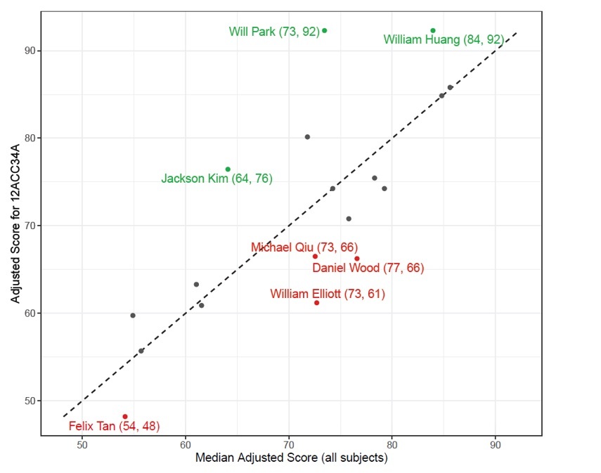
[Figure 2: Comparison of student performance (all names have been changed)]
Examples of how we’ve used improved data metrics
The primary outcome of this data project has been to improve the data metrics available, so that better decisions can be made to improve the school.
In tomorrow’s follow-up article, I will share examples of how the improved data we’ve had available has allowed us to subsequently improve the school, to provide a better experience for the whole school community.
Stay tuned: In tomorrow’s article, Patrick Saunders shares examples of how staff have used data to influence decision-making and improve the teaching, learning and wellbeing of the Brighton Grammar School community.
References
Hattie, J. (2008). Visible Learning: A synthesis of over 800 meta-analyses relating to achievement. Taylor & Francis Ltd.
As an educator, how are you using data to inform your own practice? Do you know where students are in their learning and what the next steps are? Do you know students’ strengths and weaknesses in relation to topics you’re teaching?
As a school leader, how does student and school data inform your strategic planning? How do you know that interventions and programs are having an impact?