
In my first Teacher article, I shared how our school has been building processes and systems to enable higher quality data-informed decision making. This second instalment provides specific examples of how we’ve used data to influence decisions at the school and the outcomes achieved.
In essence, most improvements in our data use have come from:
- making the data or data visualisation quickly interpretable, increasing the likelihood of it being utilised by time-poor teachers; and,
- creating a new comparative metric which allows us to unearth new insights.
While some of these examples use complex metrics and analysis, using more widely available data (particularly at the class level) can be very effective. If you’re looking to get started and a bit unsure, ask a colleague that’s good with data and start with something small like a class quiz or test. If you need help, reach out to us at Brighton Grammar School’s Crowther Centre at any time – we have considerable experience with helping other schools setting up their own data systems.
Example 1: Examination data
The data provided to schools from exams for Victorian Certificate of Education (VCE) Units 3 & 4 includes question-level data (including the class, school and state average for each component of a question or criterion). The table with this data also includes a qualitative assessment of the performance of the school or class in relation to the state. When looking to use this data as part of an analysis we encountered the following limitations:
- The data is limited to an individual year.
- If the school or the students in a particular subject are generally performing well above or below the state, it can be challenging to assess relative strengths and weaknesses using the qualitive comments provided (i.e. the questions where the performance was better or worse than would be expected for that cohort).
To enhance our analysis, we produced an interactive graph using Microsoft Power BI (as shown in Figure 1). By graphing the percentage of students that got a question component correct in the school against the state in this way, we were able to produce a line of best fit for the data. This line can then act as a proxy for cohort strength, i.e. the higher the line, the stronger the cohort is relative to the state. The line of best fit can then be used to judge the relative performance of the cohort on different exam questions.
For example, in Figure 1 there is only one component that is in the red, but this isn’t the only component that we should look at. By having the line of best fit to compare to, we can highlight additional weaknesses that need to be addressed. The circled dot point shows that on Q2c of this exam, the school had a 55 per cent average while the state had a 50 per cent average. By comparing to the line of best fit, we can see that the performance on this question component was well below the cohort’s performance in the other questions. This analysis provides the basis for actionable changes to curriculum and pedagogy in the following year(s). The additional benefit of using this visualisation is that you can complete analysis of many years of data looking for trends over time.
In this example, many of the lower performing question components dealt with content involving scientific methodology and this trend could be observed over several years; to address this issue some explicit lessons were developed on that content and included in the sequence for the following year, leading to greatly improved performance.
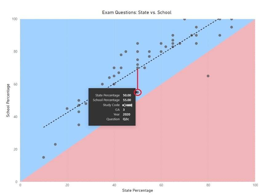
[Figure 1: Graph comparing the state and school percentage on a particular exam]
This type of analysis isn’t limited to high stakes exams but can also be used by individual teachers, subjects or departments as a way of assessing relative performance on most formative and summative assessments. It’s possible to create a similar non-interactive graph within more widely available programs such as Microsoft Excel for schools looking to create this visualisation in their own context; Power BI and similar visualisation tools like Tableau do require some coding experience, that we’ve developed in-house at the Crowther Centre, but allow for more adaptive manipulation of the data to help decision making.
Example 2: NAPLAN
All Australian schools look at and use NAPLAN scores as a way of measuring performance and progress of their students in literacy and numeracy. The scaled scores provided to schools typically range from zero to 1000. The only way to attempt comparisons between years and different tests is to use equivalence tables. However, we found that this set-up limited our ability to compare across different tests and different years, and thus reduced the usefulness of NAPLAN testing as an analysis tool for our school.
The solution we constructed was converting these scaled scores into a percentile, like an ATAR score (click on the link for a more in-depth explanation). The approach is moderately complex but, in this way, we’ve used the performance of the state as the comparison group to assess the performance of each Brighton Grammar School student in each test. Again, if you’d like to learn more about our method reach out to us at the Crowther Centre.
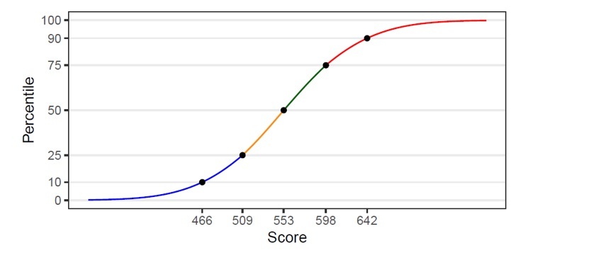
[Figure 2: An example of NAPLAN scaled scores converted to percentiles]
Having the scores as a percentile greatly enhanced our ability to track the progress and performance of our students. It was now possible to compare across different contexts (grades, year, and components). For example, instead of knowing that Sam Smith* got 499 in Year 7 numeracy and 620 in Year 9, we could now see his percentile was 45.0 in Year 7 and 53.2 in Year 9, meaning he made much better progress than the state average.
When we initially created this method in 2019, we used it to review historical NAPLAN data; generally, progress and performance was good but writing progress, particularly from Years 7 to 9 wasn’t at the desired level. This led to the construction of a strategy to address this area of need that included actions such as:
- appointing a Head of Literacy to oversee the program;
- implementing cross-curricular writing strategies; and,
- explicitly teaching sentence level structures from The Writing Revolution (as summarised in this podcast).
The results from the 2021 NAPLAN testing, after implementing the above, indicate that the growth in Writing from Years 7 to 9 is the largest on record at Brighton Grammar School and the Writing performance for the Year 9 group was the highest on record. The median percentile increased by 14.5, meaning that our students made dramatically more progress than the state as a whole – a huge, relative improvement.
It’s wonderful to now have a metric that we can use to more easily and confidently make assessments of the progress and performance of our students, and take actions that results in strong and measurable improvements in our academic program.
Example 3: Pastoral reports
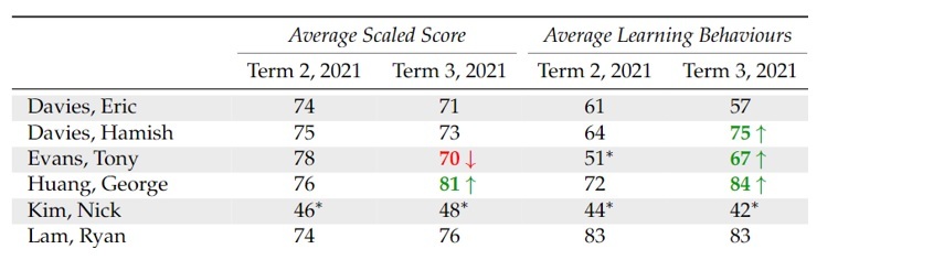
While much of our pastoral program focuses on wellbeing and relationships, another related aspect is providing a ‘learning mentor’ for each student. As such, we regularly produce different pastoral reports for House Tutors and Heads of House, as shown in Figure 3, to help them in this mentoring capacity.
To create these reports, we have introduced a new metric called ‘learning behaviours’. This is created through combining data on restorative conversations, effort in class and attendance, and some other measures. We then convert these scores into a percentile within the year level, in essence using the cohort itself as the comparative group to create a measure for each individual student.
While much of the detail gets lost when reducing a range of behaviours down to one number, it is quick for a teacher to use. The intention with these reports is to use the data to ask questions and start conversations, and thus ease of use was prioritised over having multiple measures for robustness. It has also proven useful for constructing seating plans and balancing out the classes, so no teacher ends up with a particularly challenging class.
[Figure 3: An excerpt from a House Tutor pastoral report*]
The impact of these reports has been wide-reaching. As an example action, we often use notable changes in scores or behaviours as a way of celebrating improvements or as an early warning sign of other issues – these are then explored through conversation with the student. This means we’re more frequently able to identify and help with issues in a proactive manner for students.
We’ve been able to pick up and support students with things such as family issues, medical problems and relationship breakdowns much earlier than we would have otherwise. Data isn’t all about academic improvement but can also be used to improve other outcomes, such as the wellbeing of our students.
My hope is that the examples I’ve shared in this article inspire you to think about the use of data in your own school and find ways to start using it to improve the teaching, learning and wellbeing of your school community.
*All student names in this article have been changed.
As an educator, how are you using data to inform your own practice? Do you know where students are in their learning and what the next steps are? Do you know students’ strengths and weaknesses in relation to topics you’re teaching?
As a school leader, how does student and school data inform your strategic planning? How do you know that interventions and programs are having an impact?