In today's Q&A we chat to Dr Jo Peryman and Dr Janneke Blijlevens from Melbourne's RMIT University about the creation and early testing of Sans Forgetica, which is a new font designed to help students remember key information.
Peryman (Chair of the RMIT Behavioural Business Lab and a behavioural economist) and Blijlevens (Senior Marketing Lecturer – Experimental Methods and Design Thinking – and founding member of the RMIT Behavioural Business Lab) worked with RMIT lecturer in typography Stephen Banham on the font. Initial experiments in the lab and online have already produced some promising results. Here, they talk about what's happened so far, the psychological and design theory involved, and the next steps in terms of future research.
You've completed two experiments with around 400 university students. When did those happen?
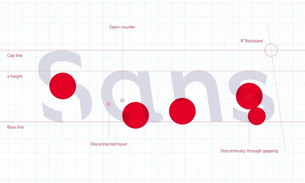
Jo Peryman: The lab experiment (with 96 students) was the first one that we did back in July. We wanted to trial a few different fonts according to breaking design principles. What we see with Sans Forgetica is that it has gaps in the letters, but it also has a back slant – so, two different design rules that we were breaking. We tested two other fonts, so we gradually broke these principles. The first one was just a gapped Albion font, the second was the Albion font which turned out to be Sans Forgetica, and the third one was an Albion font that was back slanted, gapped, and asymmetric. … We found that Sans Forgetica led to the best recalls of word pairs. Because we found this an interesting result we wanted to follow this up with an online study. We ran that (with 303 students) in August over a few days.
[The three new fonts used in lab trials. From top to bottom: a gapped version; gapped and back slanted; and gapped, back slanted and asymmetric. Images: RMIT]
The experiments were with university students. Could this be applicable to school students?
Janneke Blijlevens: The psychological principle behind this is called ‘desirably difficult'. The font needs to be difficult enough to read but not too difficult. So, there's a desirable point, or a sweet spot, where it is engaging yet legible. This is a general psychological mechanism that works in everyone's brain. These students [in the lab and online experiments] were between 18- and 25-years-old – we think that this psychological principle, and thus the font, applies to younger students as well. Of course, we do want to test that in a K-12 setting. In the classroom would be great and we'd love to do that in our future research. We think that our results are generalisable but, as you know, we always want to continue testing and validating our results.
Can you explain what happened in the lab experiment?
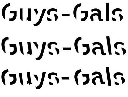
JP: We got participants to read word pairs in the three new fonts, plus a standard plain Albion font. Some of the examples of the word pairs were: ‘stew' and ‘meat'; ‘pour' and ‘rain'; ‘guys' and ‘gals' – so, they're all things that are related to each other. The reason we chose these particular word pairs is that these pairs have been used in previous research and found to have the same level of association, so they're all comparable.
We had 20 word pairs in total and each word pair was shown on the screen for 0.1 seconds, which sounds short but, actually, when you're seeing it pop up it's a surprisingly long amount of time. It's enough for us to read and process it.
JB: The timing is based on basic psychological research where they have used word pairs before to test memory. So, we followed that to a tee. We have to make sure the timing is the same for all of the word pairs, so we can compare our results across the word pairs.
[In the lab test, word pairs in different fonts were flashed up on a screen. Image: RMIT]
JB: [The trial was what we call] a semi-randomised, or balanced, control. We had five word pairs presented in each font type and then it was randomised across participants exactly which word pairs were presented in what font.
JP: The participants were then given a list of 20 of the first words from each pair and asked to fill in the blanks. We found the third new font broke too many design rules (back slanted, gapped, and asymmetric), it was too difficult for people to engage with and understand, whereas Sans Forgetica broke just enough of these rules.
Participants recalled 69 per cent of the word pairs that were presented in Sans Forgetica compared to 61 per cent of the pairs presented in either the gaps-only font and the back slanted, gapped and asymmetric font.
JP: For the standard Albion font, we found 68 per cent correct word pair recalls. However, our goal was to design a new font according to desirable difficulty which expects to see an inverted u-shaped relationship with memory. We found this relationship with the gaps only font (low difficulty, low memory), Sans Forgetica (medium difficulty, high memory) and the gaps, back slanted and asymmetric font (high difficulty, low memory).
How did the online experiment work?
JP: In the online experiment we gave participants sections of text to read about random topics. Each section of text was 250 words in total – three paragraphs. One of the three paragraphs was written in Sans Forgetica. Each participant saw five different texts in total. For each text they were asked one question about the part written in Sans Forgetica and another question about the part written in standard Arial. We were trying to mimic an exam scenario – you're reading some course notes, you're asked in the exam multiple choice questions about it, how well can you recall that information? We found that for the paragraphs written in Sans Forgetica participants scored higher on the questions related to that part, compared to the questions related to information presented to them in plain Arial.
Participants remembered 57 per cent of the text when a section was written in Sans Forgetica, compared to 50 per cent of the surrounding text that was written in a plain Arial font.
Stephen Banham has described the font as a bit like blue cheese – okay in small portions. When would you see it being used? You wouldn't recommend doing an entire lesson in Sans Forgetica?
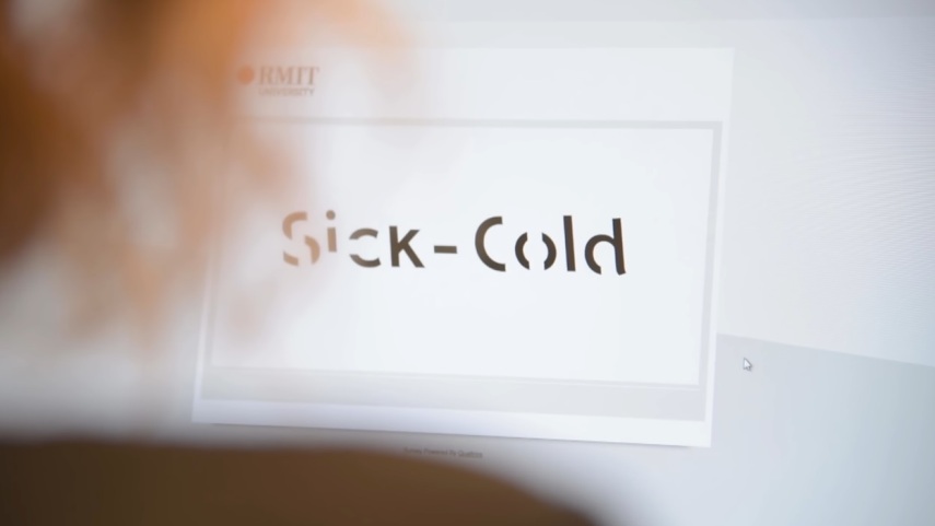
JP: Sans Forgetica we think is best used to emphasise certain parts of a text that may contain key information that we'd like students to remember, such as a definition or a historical date, or specific names. Because the font is designed to make reading a little bit more difficult, we think if we put a whole text in it then the material is going to become too difficult and too time consuming for people to actually read. We think it would become quite frustrating if the entire text was presented in Sans Forgetica – it might make people lose interest in studying entirely, which is not good. It would be better just to [use it to highlight] certain passages that contain key pieces of information that we'd like students to focus on and specifically retain.
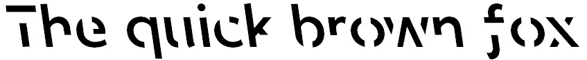
[An example of Sans Forgetica. Image: RMIT]
In terms of research then, this is early days isn't it? You've started with the lab experiment, thought the results were interesting and followed that up with an online experiment. What happens next?
JP: We think we've got some meaningful results from what we've done so far. The challenge now is to generalise this to other contexts – maybe try different settings, different age groups, possibly even other applications that it could be used for. We're keen to take it out into the field as well. So, we've done the lab and online experiment, but the next step would be running this with students who are studying for a real exam to make sure that it works in the real world. We're definitely keen to do further research on this.
Did you do any testing with numbers or was it just letters?
JP: We've only done letters, but I think the same psychological principles should work on numbers as well. Students have to remember numbers quite often, or formulas when they're studying for exams so it would be interesting to test, but I think there's no reason why it shouldn't work.
What about existing research in this area – fonts as an aid to study or memory?
JP: Most of the literature says that we're inclined to make things easier to read and we feel like the easier they are to understand the better our memory will be. I think what we're doing is a little bit counterintuitive because we're saying ‘hey, we want to make reading it a little bit more difficult' and using the desirable difficulty principle. Like Janneke said, we wanted to find the sweet spot of difficulty. If it's too easy people are not going to engage enough with the materials, if it's too difficult the brain can't process the material to begin with – our main experiment was quite promising in showing that principle is at work. Sans Forgetica is desirably difficult, just difficult enough, and I think it's quite different to the previous literature. It's one of the first times that this principle has been applied in this way.
Blijlevens explains that typical fonts are very familiar, which means readers often glance over them and there's no memory trace created, but just enough obstruction has been added to Sans Forgetica to created that memory retention.
JB: Desirable difficulty is not a new thing, or coined by us (Diemand-Yauman, Oppenheimer & Vaughan, 2011; Yue, Castel, & Bjork, 2013). We are the first to then apply this to design principles, and breaking design principles, to create a new font that helps memory. … An interesting takeaway from this is that this is really the result of three people with completely different backgrounds coming together to come up with something quite impactful. We believe that that's how innovation and impact happens, when people start working together from different points of view.
Related reading
Diemand-Yauman, C., Oppenheimer, D. M., & Vaughan, E. B. (2011). Fortune favors the bold (and the Italicized): Effects of disfluency on educational outcomes. Cognition, 118(1), 111-115.
Yue, C. L., Castel, A. D., & Bjork, R. A. (2013). When disfluency is—and is not—a desirable difficulty: The influence of typeface clarity on metacognitive judgments and memory. Memory & Cognition, 41(2), 229-241.
The team at RMIT has made Sans Forgetica available free to download as a font and Chrome browser extension at sansforgetica.rmit