
Students learn best in calm, organised and purposeful spaces. Classrooms can sometimes be overwhelmed by good intentions; every wall covered in colour, slogans and displays competing to be seen. At some point, decoration and displays intended to support and celebrate learning cross into distraction.
What can designers teach educators about classroom displays?
In design, when everything is loud, the brain stops listening. Eye-tracking studies show that when multiple elements compete for attention, the brain spends longer scanning and takes more time to decide (Rayner, 1998). The same thing happens in the cereal aisle: when every box shouts, nothing stands out.
Research in education says the same. Fisher, Godwin and Seltman (2014) found that students in highly decorated classrooms were more distracted and performed worse on learning tasks than those in simpler spaces. This is not to say that a classroom should be devoid of decoration, but it should serve a purpose.
Here are 4 design principles to help turn classrooms into spaces that not only look good but work for supporting and celebrating student learning.
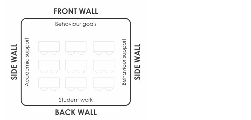
Visual hierarchy – not all walls are created equal
In design, hierarchy means guiding the eye toward what matters first. In classrooms, this starts by realising that not all walls are created equal. Each zone serves a different purpose and recognising that difference can transform how students interact with the space.
[Image supplied]
Front wall: The front wall is the highest value visual real estate. This space should feature content that applies to every lesson, every day.
As Bill Rogers (2015) reminds us, ‘You can’t teach through misbehaviour,’ underscoring the importance of clear behavioural expectations. You can use the front wall space to highlight 2 or 3 clear behaviour expectations that match the class’s current needs; more than that and attention fragments. Remember, the goal is clarity, not decoration. Behaviour reminders work best when they are visible, simple and alive in daily routines.
Routine displays like job charts or line-up orders still matter, but they do not need constant visibility. Those belong on the side walls – ready when needed but not competing for attention.
Side walls: Side walls are for medium-priority information such as scaffolds and reference materials that support learning and behaviour when needed but do not need to dominate attention. Think phoneme charts, number lines and vocabulary walls; these displays belong here. They are close enough to the students to be useful, yet not in constant view, only accessible when needed.
A simple rule that helps is: if a display is not referenced by the teacher at least once every 2 or 3 weeks, it does not belong on the wall. At that point, it becomes a historical archive. Replacing it with something relevant to the immediate curriculum creates both a dynamic space and one more conducive to learning.
Back wall: The back wall receives the least visual focus during learning, making it perfect for long-term or pride-based displays. Student artwork, maps or timelines fit well here. This space celebrates learning without stealing valuable attention during instruction.
Teacher reference materials, such as timetables, behaviour flowcharts and checklists are essential tools but not student visual aids. They belong inside cupboards, in hidden corners or on clipboards within reach of the educator. These items should support teaching without competing for attention.
Empty space is not a gap, it is cognitive support
In design, empty space is not wasted space; it is a tool. It allows the eyes to rest, gives information room to breathe and helps the mind focus. Sometimes we can forget this in classrooms and treat blank walls as problems to be fixed with paper, borders or colour.
Empty space works better than any patterned trim to centre information. It helps the brain group information and tells students where to look first. Cluttered walls create noise; open walls create focus. Straight lines, alignment and spacing might sound minor, even boring, but they quietly shape how students process information.
Empty walls are not a sign of neglect but of deliberate design.
Whiteboard: The whiteboard is not a display surface but a workspace that changes constantly. What appears there should relate directly to the current lesson and be cleared for the next. The only permanent features worth keeping near it are behaviour expectations. Information such as daily schedules belong on side walls (see above), to be referenced by students without distracting.
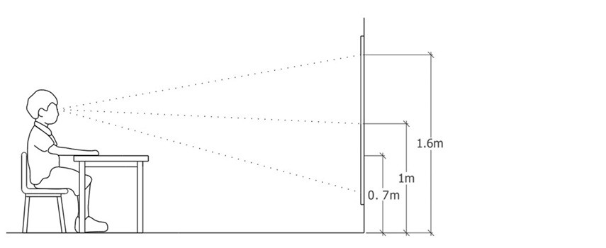
Readability matters
[Image supplied]
Designers often say, ‘If they can’t read it, it doesn’t exist’.
The Smithsonian Guidelines for Accessible Exhibition Design (2016) recommend high-contrast, sans serif text scaled to distance. A practical classroom rule is to allow roughly 2 centimetres of letter height for every metre of viewing distance. If students are seated 2 metres away, capital letters should be at least 4 centimetres high for comfortable reading.
Also, avoid writing text in all caps. It makes it difficult to read. Sans serif fonts such as Arial, Calibri and Verdana are easiest for developing readers. Script or novelty fonts might look playful but can slow decoding, especially for EAL learners or students with reading challenges.
Placement matters too. The average seated student’s eye level is between 900 and 1100 millimetres from the floor. Anything above 1500mm-1700mm or below desk height will become visual wallpaper rather than useful information. Remember: just because a wall is tall does not mean every centimetre needs to be filled.
Form follows function – decorating with purpose
Not all decoration distracts. The key is intention, whether it supports thinking or wellbeing. Seasonal and thematic displays can spark curiosity and conversation when they are fresh. A NAIDOC Week wall or Book Week display can connect classroom learning to the wider world, but when those materials stay up too long, they fade into the background.
Plants: Few design choices transform a room as simply as greenery. Research on biophilic design shows that contact with nature can lower stress and restore attention (Kellert, 2002). Even artificial plants can provide a similar sense of calm while keeping maintenance low. A small detail can completely change the feel of a space.
Sensory corners: When done thoughtfully, sensory corners can support emotional regulation. The goal is not entertainment but calm. Soft textures, muted colours and gentle light help students reset when overwhelmed. The key is boundaries: sensory-rich elements should stay contained within a single zone. A calm space only works when the rest of the classroom stays calm too.
Final thoughts and key takeaways
Many educators already implement the strategies I’ve outlined above. Remember, this is not an exercise of addition, but selective subtraction.
Museums, newspapers, books are all tools of learning and require curation and editing; classrooms are no different. Curation is key and being selective shows that not all information belongs in front of the learner at all times.
I’ve found this to be a good rule of thumb: before leaving something up, ask yourself – does it spark learning? If not, it might be time to take it down.
References
Fisher, A. V., Godwin, K. E., & Seltman, H. (2014). Visual environment, attention allocation, and learning in young children: When too much of a good thing may be bad. Psychological Science, 25(7), 1362–1370. https://doi.org/10.1177/0956797614533801
Kellert, S. R. (2002). Experiencing nature: Affective, cognitive, and evaluative development in children. In P. H. Kahn Jr. & S. R. Kellert (Eds.), Children and nature: Psychological, sociocultural, and evolutionary investigations (pp. 117–151). MIT Press. https://doi.org/10.7551/mitpress/3137.003.0008
Rayner, K. (1998). Eye movements in reading and information processing: 20 years of research. Psychological Bulletin, 124(3), 372–422. https://doi.org/10.1037/0033-2909.124.3.372
Rogers, B. A. (2015). Classroom behaviour: A practical guide to effective teaching, behaviour management and colleague support (4th ed.). SAGE.
Smithsonian Institution. (2016). Smithsonian Guidelines for Accessible Exhibition Design. Smithsonian Facilities. https://www.sifacilities.si.edu/sites/default/files/Files/Accessibility/accessible-exhibition-design1.pdf
Take a tour of your learning areas through as if you were a student – get down to their eye level, sit at student desks in different parts of the classroom.
Looking at your current classroom displays, or thinking about your existing plans for the term – do they all serve a clear learning purpose?
Which of the 4 design principles discussed in this article (visual hierarchy, empty space, readability and decorating with purpose) do you already use? Which could you strengthen?