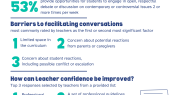
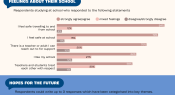
A survey of teachers in Australia has examined teacher perspectives on the role of teachers and schools in fostering respectful debate and discussion of contemporary issues. Survey topics include teacher confidence in facilitating discussions, and the barriers they face.
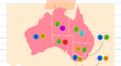
A new report has revealed the most popular ebook genres for K-12 students. The results were calculated by analysing 2025 data from all schools serving students in K-12 across Australia that use the Sora student reading app. Here, we share the most popular genres by state and territory.
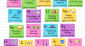
What do you need information on? Artificial intelligence? Transitions? Seating designs? The 14th Teacher alphabet brings you quick links to popular content that you might find useful. Download the PDF for a hyperlinked version so you can access the content for each letter.
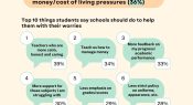
A 2025 survey of 400 school students across Australia in years 7-12 focused on the topic of wellbeing. This infographic shares some of the results related to students’ biggest worries and the top 10 areas where they believe that schools could help them.
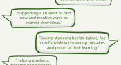
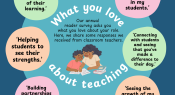
What do you love about teaching? In our annual reader survey, we ask you what you love about your role. Here, we share some responses we received from secondary school teachers.
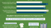
Researchers from Ireland surveyed students to examine their views on the extent to which uniforms are a barrier to physical activity and physical education participation. Findings show over half see uniforms as a barrier and many had suggestions for how the uniform experience could be improved.
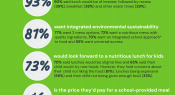
A survey of almost 400 parents has assessed their interest and preferences in a school-provided meal offering for Australian primary schools. Respondents were asked about cost, nutrition and quality, environmental sustainability, access, menu options, and the school approach to food. Here are some of the findings.
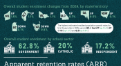
The Australian Bureau of Statistics release data on schools and students in Australia each year. The latest data for 2025 show increases in student enrolment and retention. Find out more in this infographic.
What do you love about being a teacher? Our annual reader survey includes an invitation for you to share what you love about your role in education. In this infographic, we share some of the latest responses received from classroom teachers.
Each year Mission Australia’s Youth Survey asks teenagers about their views and experiences – providing a snapshot of the challenges they face and hopes for the future. For the first time, respondents included younger students (14-year-olds) and new questions on their feelings about school. This infographic shares some of the findings.
Facebook
YouTube
SoundCloud
Apple Podcasts
Spotify
RSS feed
Linkedin