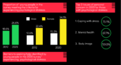
A new Mission Australia and Black Dog Institute report has analysed Mission Australia Youth Survey findings from 2012-20 to better understand psychological distress faced by 15- to 19-year-olds in Australia. Data show there has been a significant increase in the proportion of young people experiencing mental health challenges. Find out more in today’s infographic.
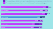
Whether it's completing homework assignments, preparing for exams, or being required to study remotely during the COVID-19 pandemic, teenage students often need to complete school work at home. But, how many have access to a desk and a quiet place to study? What about those from the most disadvantaged backgrounds?
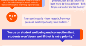
Each year, in the Teacher survey, we ask our readers to share one piece of advice they'd give to a fellow educator. Here, we share some responses from our 2020 survey on the topic of working collaboratively with students.
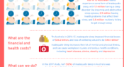
How many adults experience sleep problems? What are the financial and health costs? And, what can help to improve our chances of getting a good night's sleep? Find out in this infographic.
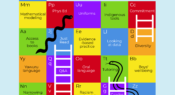
What do you need information on? Evidence-based practice? Tutoring in schools? Oral language? Data interpretation? The ninth Teacher alphabet brings you quick links to popular content that you might find useful. Download the PDF for a hyperlinked version.
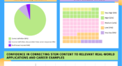
Teachers can have a key influence on the career choices of young people, so knowing their attitudes towards STEM can help us understand how students are being influenced in the school environment. Here, we share results of a survey capturing teacher attitudes towards STEM.
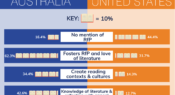
A new study has explored job titles and descriptions for school librarian jobs advertised in the United States and Australia to assess the emphasis placed on a school librarian’s role in promoting reading for pleasure. Researchers found ‘Australian school librarians are far more likely to be expected to foster reading for pleasure’.
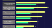
More than 900 students aged 13 and above were surveyed about ‘the prevalence of peer-on-peer sexual harassment and sexual violence, including online, in their lives and the lives of their peers’ as part of a rapid review in the UK. Here, we share how boys and girls responded, which shows boys were much less likely to think these things occurred.
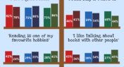
The most recent Programme for International Student Assessment (PISA) survey measured the attitudes held by 15-year-olds on reading. An Australian Council for Educational Research (ACER) Snapshot report has analysed these attitudes, and looked at how they differ between girls and boys, Indigenous and non-Indigenous students, and most disadvantaged and least disadvantaged students.
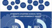
In the Trends in International Mathematics and Science Study (TIMSS) 2019, Year 4 principals were asked to report how many students in their school could do foundational literacy and numeracy skills such as ‘write their names’ and ‘recognise written numbers from 1 to 10’ when they began their first year of primary school. Find out how Australian data compare to the international average in this infographic.
Facebook
YouTube
SoundCloud
Apple Podcasts
Spotify
RSS feed
Linkedin