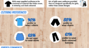
Victoria University surveyed 727 girls aged 12 to 18 to gain insight into their preferences and opinions on sport uniforms. Here, we share what clothing they prefer to wear during school sport and their reasons why. The researchers say findings from the study could enhance school and sport club uniform policy.
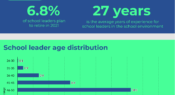
The annual Australian Principal Occupational Health, Safety and Wellbeing Survey collects information on the experiences of school leaders and their state of health and wellbeing. Part of the survey includes collecting demographic data on survey respondents. Here, we look at the age distribution of over 1800 respondents in 2020.
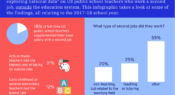
A new paper explores US data on public school teachers working a second job, outside the education system. What proportion of full-time teachers worked a second job? What type of jobs did they take? And, what were their average earnings? Find out in this infographic.
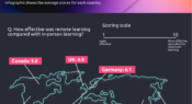
McKinsey surveyed teachers around the world for their views on the effectiveness of remote learning during the COVID-19 school closures. Teachers were asked to reflect on their experiences in the first few months of the pandemic, scoring the effectiveness on a scale of one to 10. Find out the results in today’s infographic.
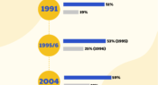
A literature review has looked at the current state of female representation in secondary principal roles in New Zealand. Here, we look at how the percentage of women in secondary principal roles has changed over the past three decades.
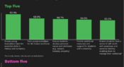
What should and should not be the responsibility of schools? A nationwide poll by the Australian National University asked parents and carers to consider this question in relation to 15 statements. Today’s infographic takes a look at the results.
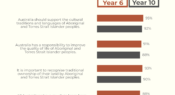
In Australia, one of the aims of civics and citizenship education is to develop understanding and appreciation of Indigenous histories and cultures. This infographic looks at students’ attitudes towards Aboriginal and Torres Strait Islander cultures, traditions and peoples.
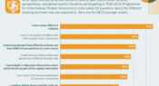
What opportunities do school students have to learn about other cultures, perspectives, and global events? Students participating in PISA 2018 were asked 10 questions about the different learning activities they are exposed to. Today’s infographic looks at the OECD average results.
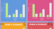
The Trends in International Mathematics and Science Study (TIMSS) measures how well Year 4 and Year 8 students perform in maths and science. The latest study data from Australia compares student performance with the number of books in their home. Here, we look at how the number of books correlates with performance.
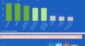
A recent survey measured public attitudes to ethical conduct across society. In this infographic, you can see how each occupational sector scored in the Ethics Index for 2020, and how different occupations within the education sector are viewed by the public.
Facebook
YouTube
SoundCloud
Apple Podcasts
Spotify
RSS feed
Linkedin