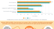
Results from the 2021 Australian Early Development Census (AEDC) collection cycle show that of all early childhood developmental domains, children’s language and cognitive skills have seen the most significant shift. Find out more in today’s infographic.
In our annual Teacher magazine reader survey, we ask you to share one piece of advice with a fellow educator. In this infographic, we share some of the responses we received about planning.
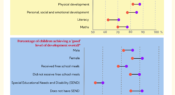
A recent study has analysed the experience of over 3000 children aged four and five attending preschool in the United Kingdom during the COVID-19 pandemic. Children's achievement in prime learning areas, as well as their overall development, during September 2020 and July 2021, were compared to national pre-pandemic averages recorded in the 2018/19 school year.
A new study from Monash University draws upon a 2019 questionnaire of 2444 Australian primary and secondary school teachers, revealing that only 41% of respondents intended to remain in the profession. We look at some of the findings from the analysis in this infographic.
A new study has found in the most recent New South Wales HSC Physics syllabus 10 individuals are mentioned and all are men, and in the last 25 years physicists have been mentioned 211 times in the subject examinations and, again, all were men. In today’s infographic we share just three (there are many more!) amazing women physicists to tell your students about.
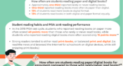
An OECD report 21st-Century Readers: Developing Literacy Skills in a Digital World analyses data from the 2018 PISA test and student survey to report on the reading habits of 15-year-olds in OECD countries. Find out more about how reading in digital and paper formats affects students’ reading performance and enjoyment in today's infographic.
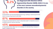
National charity ADHD Australia surveyed 1024 primary, secondary and tertiary educators in all Australian states and territories to identify their knowledge, training and experience to support students with Attention Deficit Hyperactivity Disorder (ADHD). Find out more in today’s infographic.
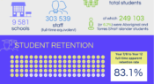
How many students were enrolled in how many schools across Australia throughout 2021? How many full-time equivalent staff members? What was the average student-teacher ratio? Find out what schools looked like in 2021 in today’s infographic.
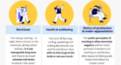
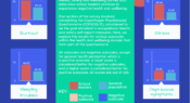
The annual Australian Principal Occupational Health, Safety and Wellbeing Survey 2021 data show school leaders continue to experience negative health and wellbeing. In this infographic, we explore the survey results for various aspects of health and wellbeing.
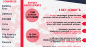
The Responses to Educational Disruption Survey (REDS) explores how the pandemic has impacted lower secondary education, investigating how 11 countries approached the challenge of ensuring continuity in teaching and learning during the disruption. Find out more about insights from the survey in today's infographic.
Facebook
YouTube
SoundCloud
Apple Podcasts
Spotify
RSS feed
Linkedin