Forums held with students in Years 6, 7 and 8 in Australia on the topic of starting high school have shed light on what concerns them the most about the transition process, and what has been helpful to them along the way. Here, we share some comments from the students.
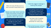
In our annual Teacher magazine reader survey, we ask you to share one piece of advice with a fellow educator. As the school holidays approach, in this infographic, we share some of the responses we received about the importance of switching off from work.
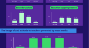
A survey of education officials and union leaders from all levels of education in 94 countries has given insight into how the teacher profession is viewed at a global scale. In this infographic, we share some of the survey responses in relation to K-12 settings.
A new issue of Snapshots, from the Australian Council for Education Research (ACER), looks at self-reported levels of effort students invested in the PISA (Programme for International Student Assessment) 2018 test. Today’s infographic looks at the percentage of students in 20 participating countries and economies who indicated they would have invested more effort in the test if it counted towards their school marks.
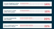
Data collected from Aboriginal and Torres Strait Islander children aged between 10 and 15 years old highlights the prevalence of racism and racial discrimination experienced by young people. Here, we share their responses to seven statements relating to self-reported experiences of direct racial discrimination in a school setting.
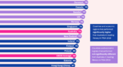
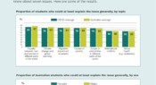
The latest edition of Snapshots, from the Australian Council for Educational Research (ACER), digs into PISA 2018 data to explore the question: How aware of global issues are Australian 15-year-olds? Students were asked to report the extent to which they knew about seven issues. Today’s infographic looks at some of the results.
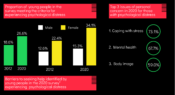
A new Mission Australia and Black Dog Institute report has analysed Mission Australia Youth Survey findings from 2012-20 to better understand psychological distress faced by 15- to 19-year-olds in Australia. Data show there has been a significant increase in the proportion of young people experiencing mental health challenges. Find out more in today’s infographic.
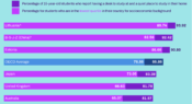
Whether it's completing homework assignments, preparing for exams, or being required to study remotely during the COVID-19 pandemic, teenage students often need to complete school work at home. But, how many have access to a desk and a quiet place to study? What about those from the most disadvantaged backgrounds?
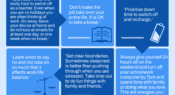
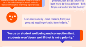
Each year, in the Teacher survey, we ask our readers to share one piece of advice they'd give to a fellow educator. Here, we share some responses from our 2020 survey on the topic of working collaboratively with students.
We’re delighted to let you know our annual reader survey is opening today. It’s the seventh year in a row we have invited you to share your feedback, and this year, if you complete our survey you’ll go into the draw to win a $500 VISA prepaid gift card.
Facebook
YouTube
SoundCloud
Apple Podcasts
Spotify
RSS feed
Linkedin